Mobile website best practices
What’s the latest?
Mobile phone usage is on the increase and that’s a fact – 72% of people in the UK now own a smartphone – by 2018 it’s estimated that 2.7 billion people will own a smartphone globally. That’s over a third of the world’s population!
The surge of mobile users worldwide over recent years has prompted Google to make a major shift in its ranking factors for mobile search. As of the 21st of April 2015, Google will put more emphasis on mobile-friendly websites when it comes to rank, but what does this mean?
Well, it could improve your website’s traffic via mobile searches, and given that it’s a better user experience for those tapping on their tablets and phones, it may improve sales and enquiries directly from a mobile device – now that’s what you wanted to hear!
What is a mobile-friendly website?
A mobile-friendly website is one that displays content clearly on a hand-held device such as a smartphone or a tablet. To make a website mobile friendly it must follow some simple rules such as:
Text should be easily readable without having to pinch your screen to zoom in
Software that’s not common to a mobile device should be avoided – e.g. high usage of Flash and JavaScript
Links should be far enough apart so that the correct one can be easily tapped – (thumb width apart)
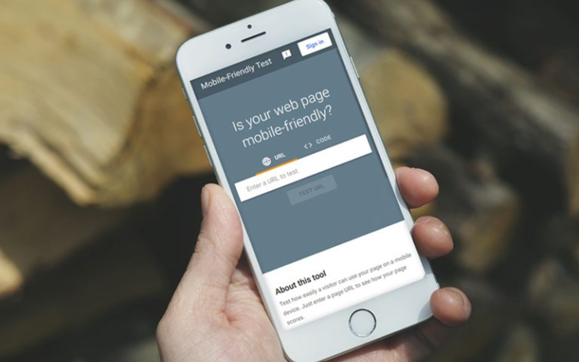
There are tons of resources and tools available in order to check the current status of your website on a mobile device, such as Google’s Mobile-Friendly Test. These allow you to see if your website is ship shape when it comes to being on the move. However, mobile isn’t for everyone right now. Even if your site isn’t as mobile friendly as it should be, if you’re not getting traffic from mobile channels it’s probably not worth the investment at this moment in time.
Responsive Design vs. Mobile Site
You may have heard of the term ‘responsive website’, which relates to how the site is coded to make it clearer for a smaller screen. Making a site responsive means that it can adhere to the mobile-friendly best practices (some mentioned above). You can read more about what responsive design is on the hub.
A mobile site is different. It’s generally hosted on a separate domain to the main desktop website (normally starting with m.), whereas responsive sites use the same code as the main desktop site but scale down the content as the screen gets smaller – magic!
For best practice and to adhere to being a mobile-friendly site, Google recommends responsive websites over mobile sites.
In Summary
If there’s one thing we’re certain of, it’s that mobile is growing. Quickly. It’s time to think mobile, the stats and the recent announcement from Google all point to this. If you are interested in finding out how mobile friendly your site is or want some advice on making it responsive, why not contact us for a chat!
Want to see some of our recent responsive projects? Take a look here…
If you want to keep up to date with the crew, don't forget to sign up to our newsletter to benefit from digital marketing expertise, as well as exciting opportunities to improve your business' performance.

Written by Lee Boothroyd
Digital director and The Bigger Boat co-founder, Lee has more than 20 years’ digital experience under his belt and heads up the five-man web development team.
News and insights
Insights from below deck: March 2024
Content that ‘takes pressure off’, social media consumer secrets, and 2023’s most successful digital PR campaigns are some topics that got the team talking this month.
Read moreNews and insights
How to make the most of a corporate event
There’s more to showcasing than simply buying a stand. Here, we outline how to get the most from your budget, from planning to exhibiting to marketing.
Read more