The Bigger Boat's top logos
I recently came across the 2011 issue of Creative Review, in which they had published an online article about their top 20 Logos, delving into the research that had gone into choosing these logos.
This included the artists and writers that had nominated their favourite logos and their reasons behind their choices. As I read through this, I thought it might be fun ask everyone in the office what their favourite logo is, and their reason for it.
Kara (me)
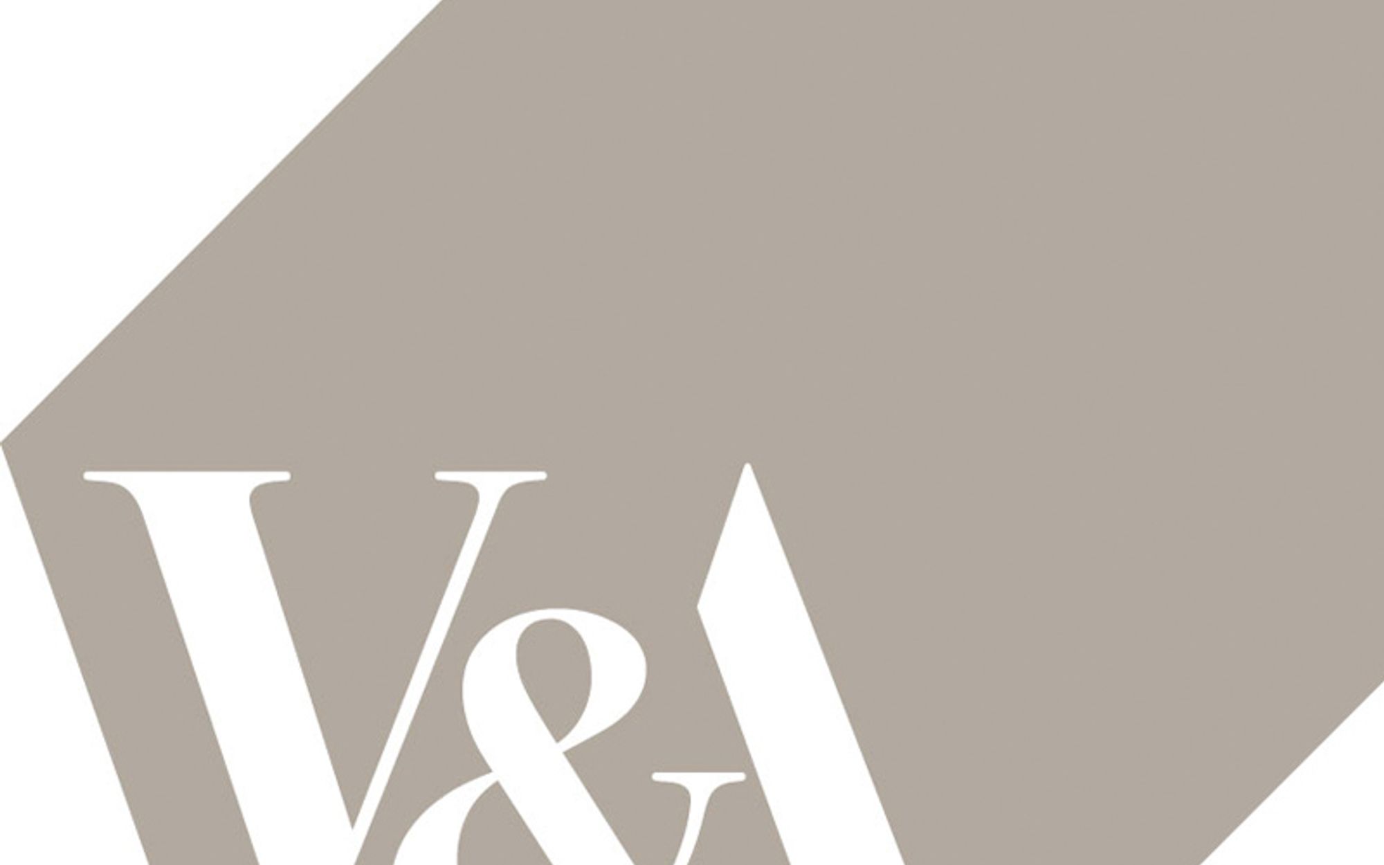
Favourite Logo: Victoria & Albert Museum by Alan Fletcher
 Why: I love ampersands and I think any logo that successfully uses one is pretty incredible – take Hole & Corner for another example. I think what makes V&A even more amazing is the relationship between the elements; Fletcher spent two weeks cutting out the letters and reordering them until he had his ‘eureka moment’ in the shower. He ran to work and successfully made, in my opinion, the world’s most beautiful logo.
Doug
Favourite Logo: FedEx by Landor Associates
 Why: The FedEx logo might appear simple, boring even, to the casual observer. But once you have spotted the forward-facing arrow created by the negative space between the ‘E’ and the ‘x’, it is impossible not to think, “That’s clever”.
Mark
Favourite Logo: Spartan Golf Club by Richard Fonteneau
 Why: Whilst it might conjure up images of the 300 Spartans defending their lands against the Persian’s, you’re more likely to be shooting birdies around the Spartan Golf Club. The illusion is really good, with the path of the swing forming the mane of a Spartan helmet, and the golfer’s body forming the face. Grab some tartan trousers and hit the fairways.
Dave
Favourite Logo: Sonos by Bruce Mau Design
 Why: I love the Sonos logo which pulses as you scroll down… it brings a static image to life, incorporating exactly what Sonos is all about – sound. The pulsing effect represents the sound waves coming from a speaker, which is no mean feat in a static image. Once you start scrolling up and down, you won’t be able to stop – it’s so utterly memorizing. Plus it’s a palindrome, and who doesn’t like a palindrome?!
Laura
Favourite Logo: Santa Cruz Logos by Jim Phillips, & Jimbo Phillips
 Why: I like that there are lots of variations of the red/yellow logo as well as the iconic blue hand. Also, I love the massive skate/surf culture history surrounding the brand, and how they’ve brought a retro feel to the logo.
Hannah
Favourite Logo: Sony Vaio by Timothy Hanley
 Why: I like this one. I think it’s clever as the V and A represent an analogue wave, and the ‘I’ and ‘O’ as a 1 and 0 from the digital world.
Lindsey
Favourite Logo: Unilever by Wolff Olins
 Why: Each individual icon represents something important to the business. I think it’s very clever and it’s great that they have managed to incorporate all of their values and everything they are passionate about just in one logo.
Lee
Favourite Logo: BMW by Franz Josef Popp
 Why: I like the fact that it’s not changed in almost 100 years….unlike every other brand that feels the need to change them every other week!
Andy
Favourite Logo: Deuren
 Why: You’ll laugh as mine is a client – Deuren.
What I like about it, clean & modern but reflects the craftsmanship and heritage of making doors. I also prefer icons as part of a logo – when they make sense and haven’t just been plonked there for the sake of it. If you can remove type and just have an icon, and people know who you are and what you do…. you’ve made it.
If you want to keep up to date with the crew, don't forget to sign up to our newsletter to benefit from digital marketing expertise, as well as exciting opportunities to improve your business' performance.

Written by Kara Clifford
Design perfectionist Kara adds creative flair to all our projects. Her skills lie in print, branding and moving image.
News and insights
Insights from below deck: March 2024
Content that ‘takes pressure off’, social media consumer secrets, and 2023’s most successful digital PR campaigns are some topics that got the team talking this month.
Read moreNews and insights
How to make the most of a corporate event
There’s more to showcasing than simply buying a stand. Here, we outline how to get the most from your budget, from planning to exhibiting to marketing.
Read more