Mirri
Celloglas is one of the UK’s leading print finishers. Its sister brand Mirri, which is a world-leading supplier of metallic paper and board, required a campaign to drive awareness of its versatility and educate designers and printers on how to get the best out of it. The result – A Guide to Mirri – allowed us to unleash our creativity, experiment with the product and create a stunning booklet to educate and inspire Mirri users.
The challenge
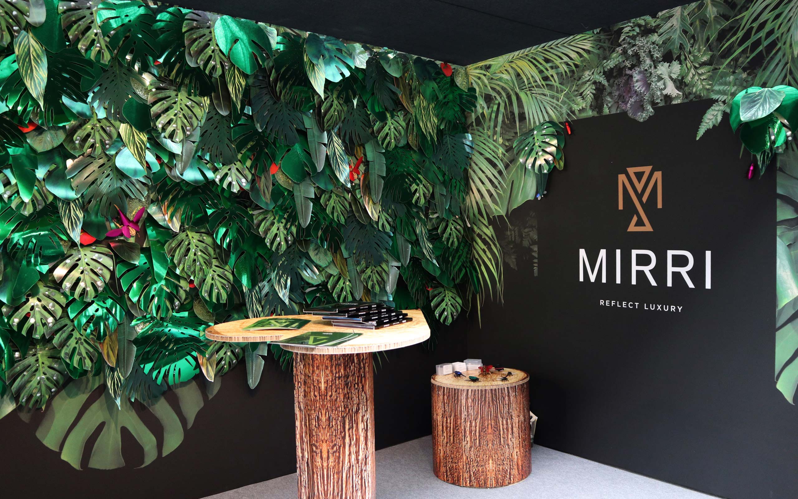
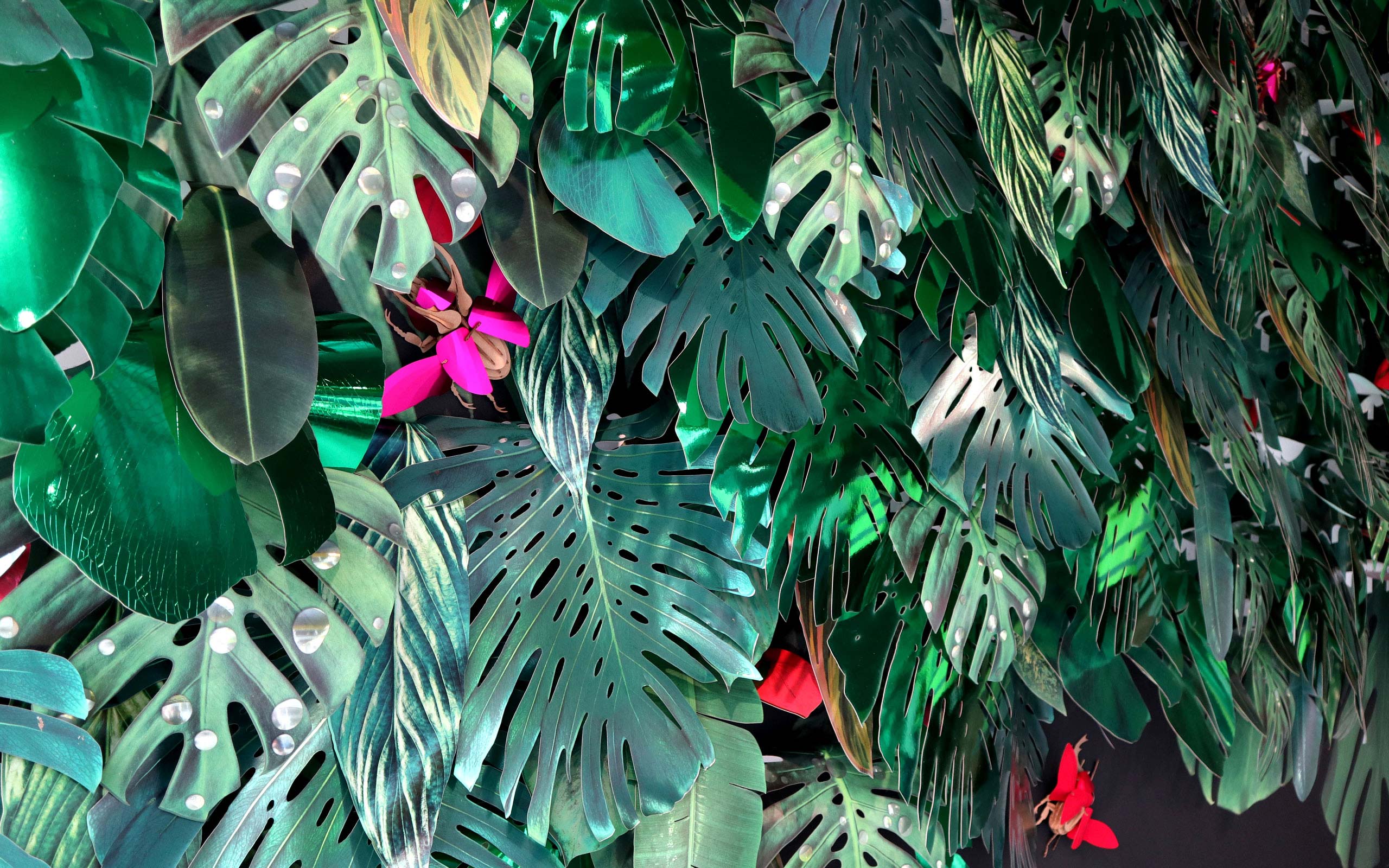
As part of an ongoing programme, Celloglas asked us to help promote its luxury packaging and POS material Mirri to creatives and printers. We specifically wanted to show how versatile the material is and provide inspiration to demonstrate how it can be used for much more than silver and gold at Christmastime (which is what it’s historically been associated with).
We also knew the result of the project had to be an educational piece to explain to the target audience how to get the best out of the material. It was required to speak to printers and designers alike so it was important our finished project was creative and aspirational to really demonstrate what can be done with the substrate.

How we've helped
We used a range of colours, paper, imagery and printing techniques to create a 28-page, perfect-bound book. It has a die-cut cover to maintain the new graphic language we had created and shows off the various ways of using Mirri right from the start.
The book contains all the vital information a printer or designer needs to get the very best out of Mirri without it being crowded and overwhelming. Tips include how to underpin images with white ink and the difference between using Mirri H and printing a colour on to a more traditional silver – we created a tipped in leaf, so we could easily communicate this to the reader.
We interspersed the brochure with lots of our own images to demonstrate the material’s true potential – every image was strategically chosen to showcase the best of Mirri based on the Mirri type and paper used.


Sample cards
We also included step-by-step diagrams to educate designers and printers on how best to show images on Mirri. We produced all the copy throughout to best detail what we have learned from our own experience of Mirri.
It was a dream project for us – we could flex our creative muscles and typographic skills while learning so much by exploring and experimenting with the material. It was certainly a challenge, both in design and production (thanks to print and finishing company Pressision for helping us create such a beautiful job) but we’re proud to be the creative agency informing others how to get the most striking results from Mirri in this stunning brochure.
To run alongside the guide to Mirri we also created a suite of Mirri sample cards. The sample cards are a more in depth showcase of the entire range.

Richard Pinkney
Business development director, Celloglas


Kara Clifford
Graphic designer, The Bigger Boat