Swimbabes
A much-loved swim school for more than 20 years, Swimbabes helps babies and children build confidence in the water through fun and nurturing lessons. With a strategic refresh informed by our longstanding relationship with the brand, we combined its heart and heritage with a modern look and feel to produce a powerful identity modern families can connect with.

The challenge
Swimbabes’ existing brand – originally created by The Bigger Boat – had served it brilliantly for more than 20 years. Loved by parents, staff, and little swimmers alike, it carried strong emotional equity and a deep sense of trust. But as the business expanded and design trends evolved, this visual identity began to feel dated. Its beloved mascot, Bob, remained integral to the brand’s personality but had lost some of his magic, appearing inconsistently across marketing materials and lacking the energy that once made him so distinctive. And, for an organisation built on connection and community, the brand no longer felt reflective of the swim school experience.
Swimbabes needed a refreshed identity that would ensure it remained comforting and familiar yet unmistakably modern. In one sense, it had to retain the warmth and reassurance parents instantly recognised, honouring the legacy and affection nurtured for more than two decades. However, equally important was injecting a new sense of confidence to help Swimbabes stand out, resonate with new families, and feel every bit as dynamic yet personal as the experiences it delivers. Crucially, it needed to be easy for employees to apply consistently in content marketing too.

Our solution
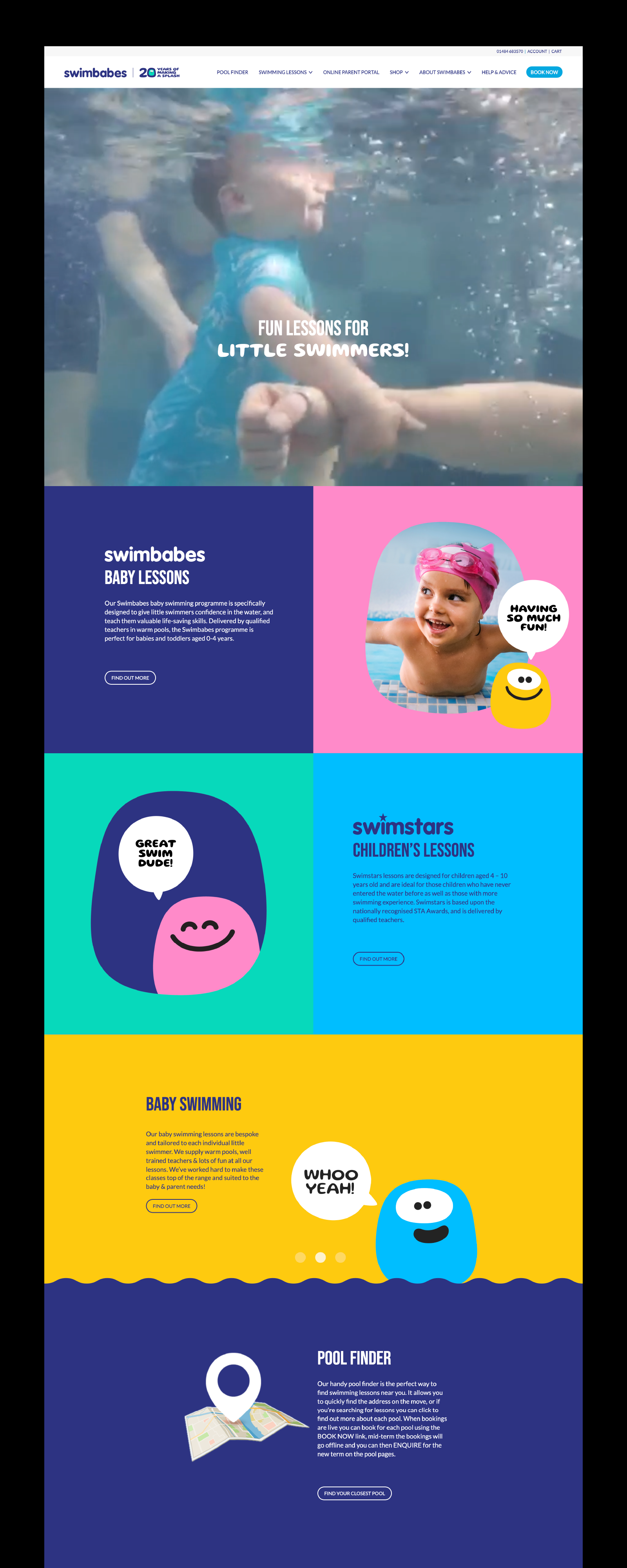
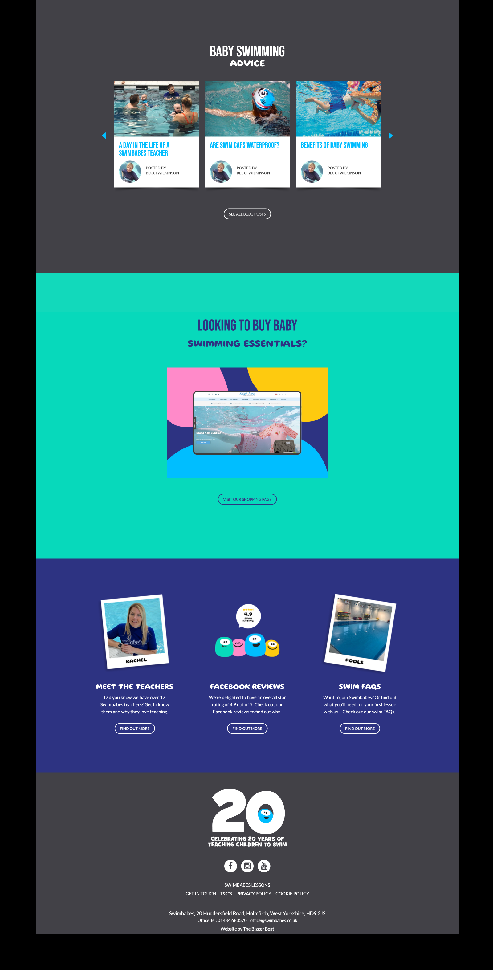
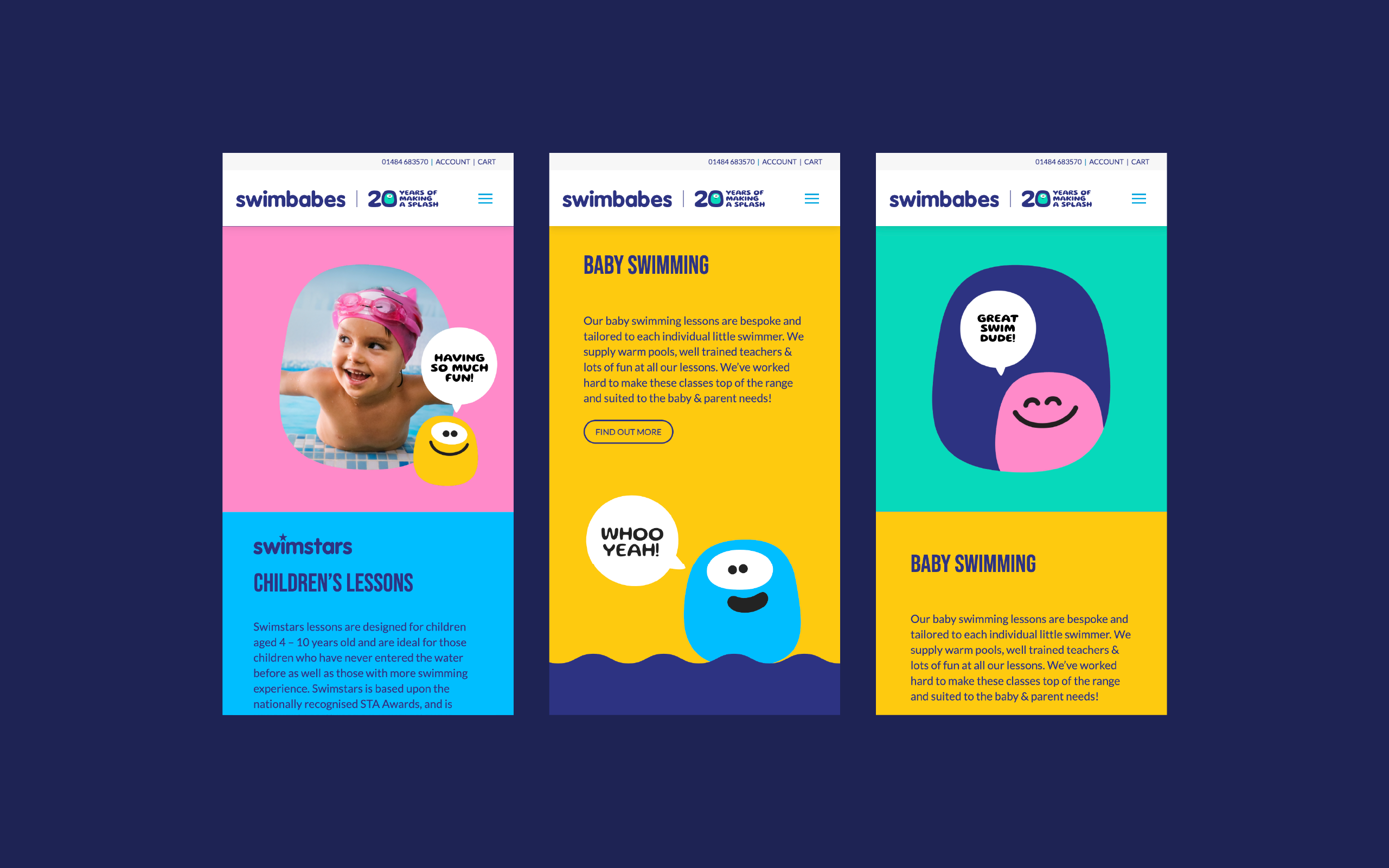
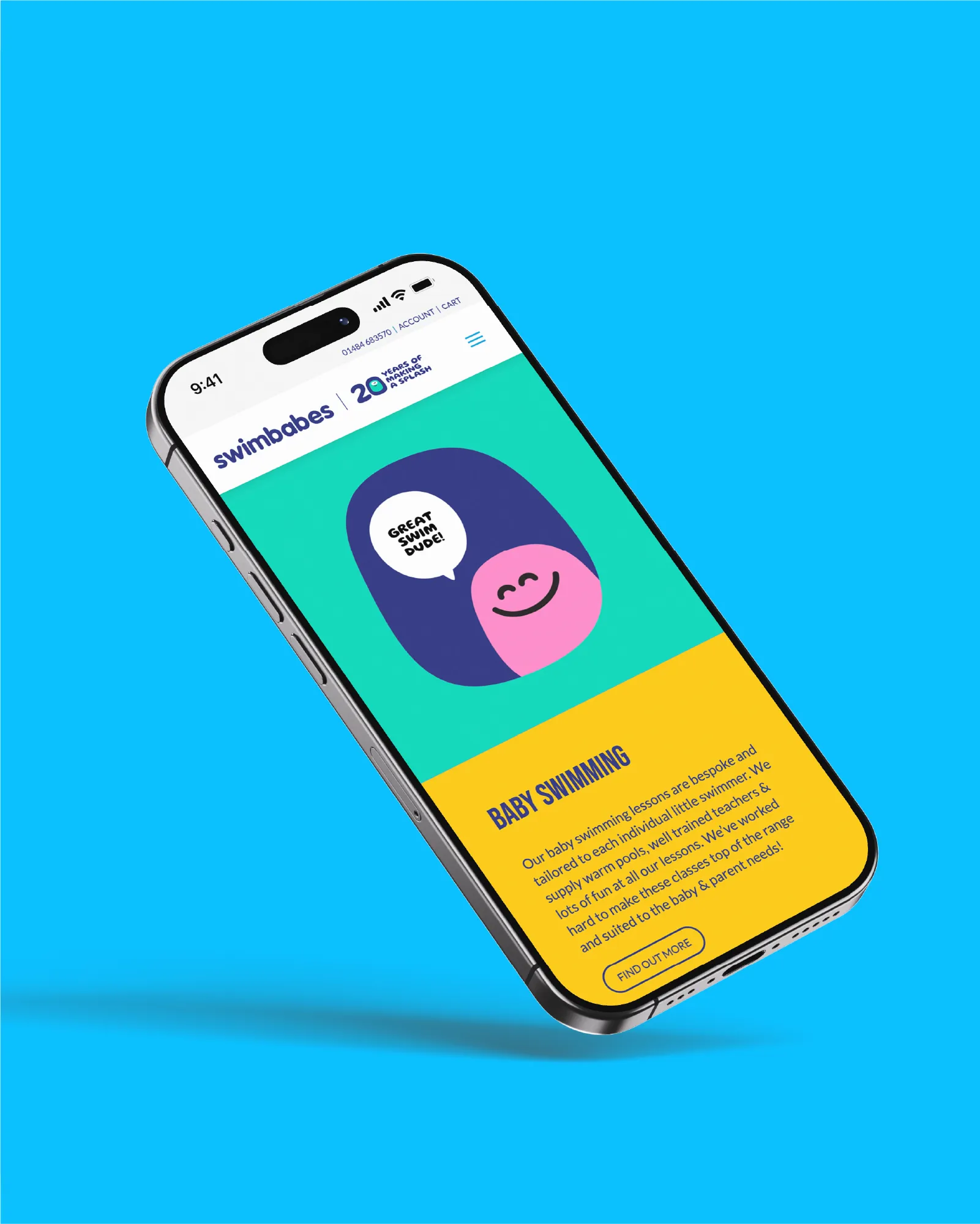
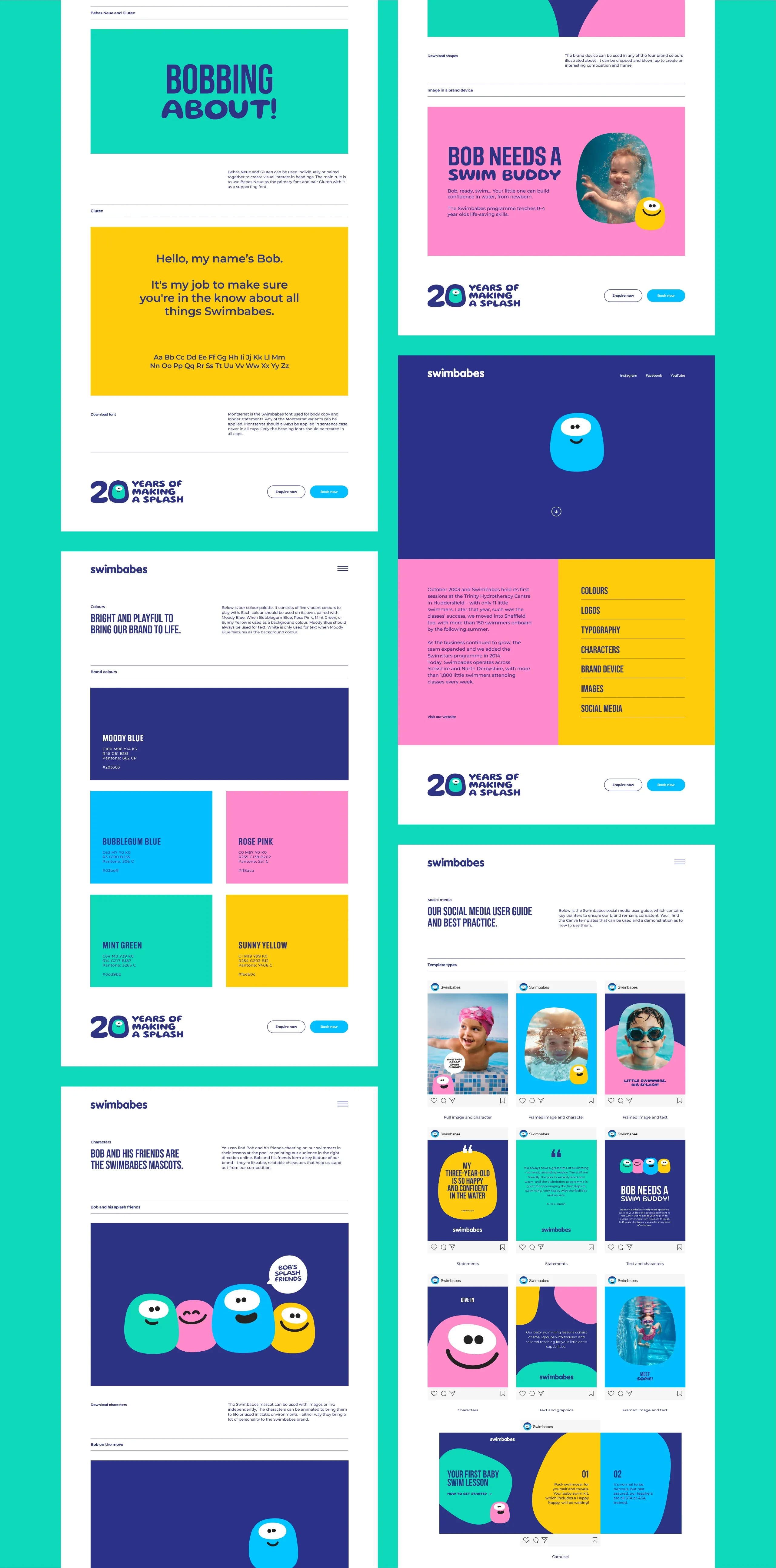
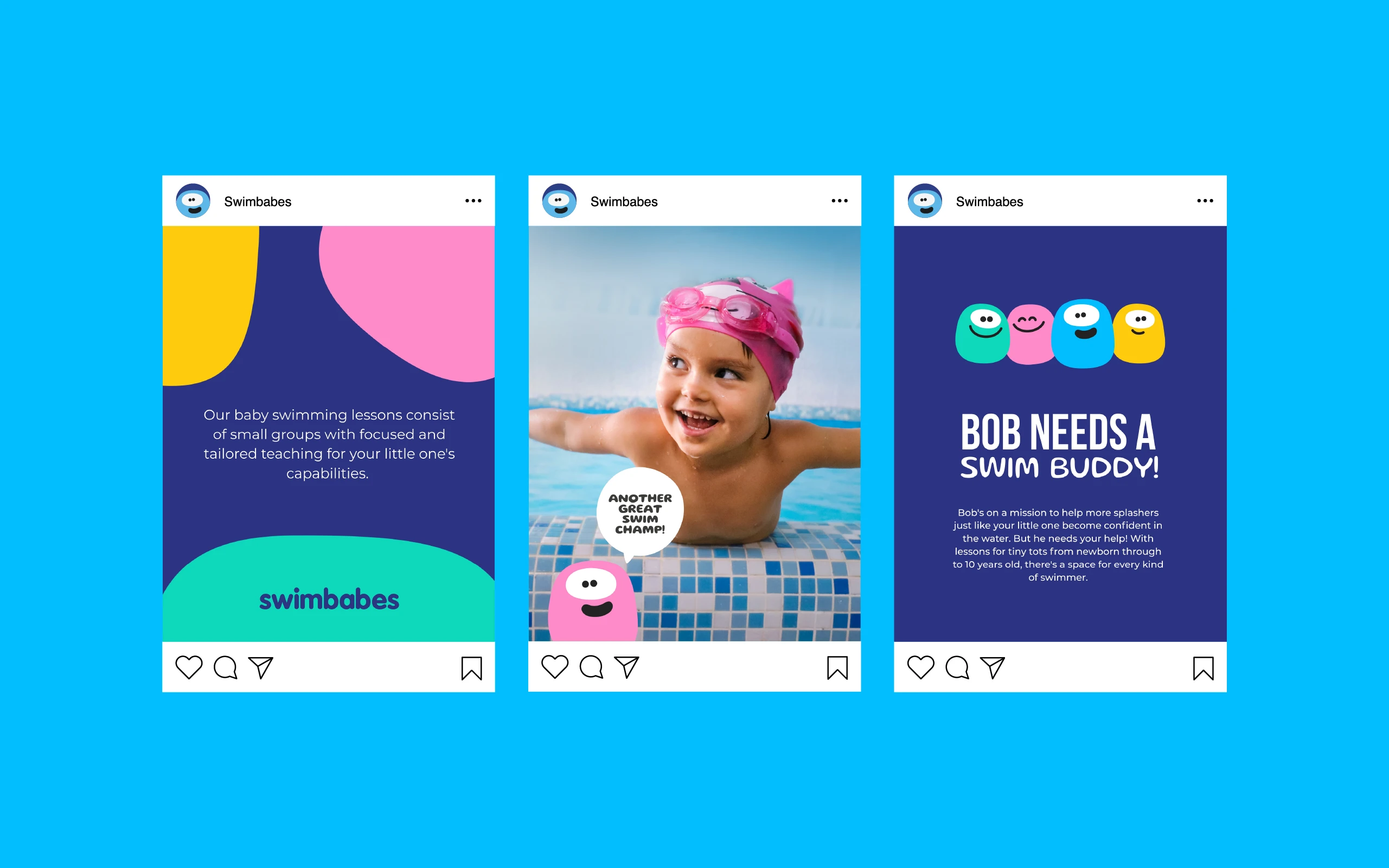
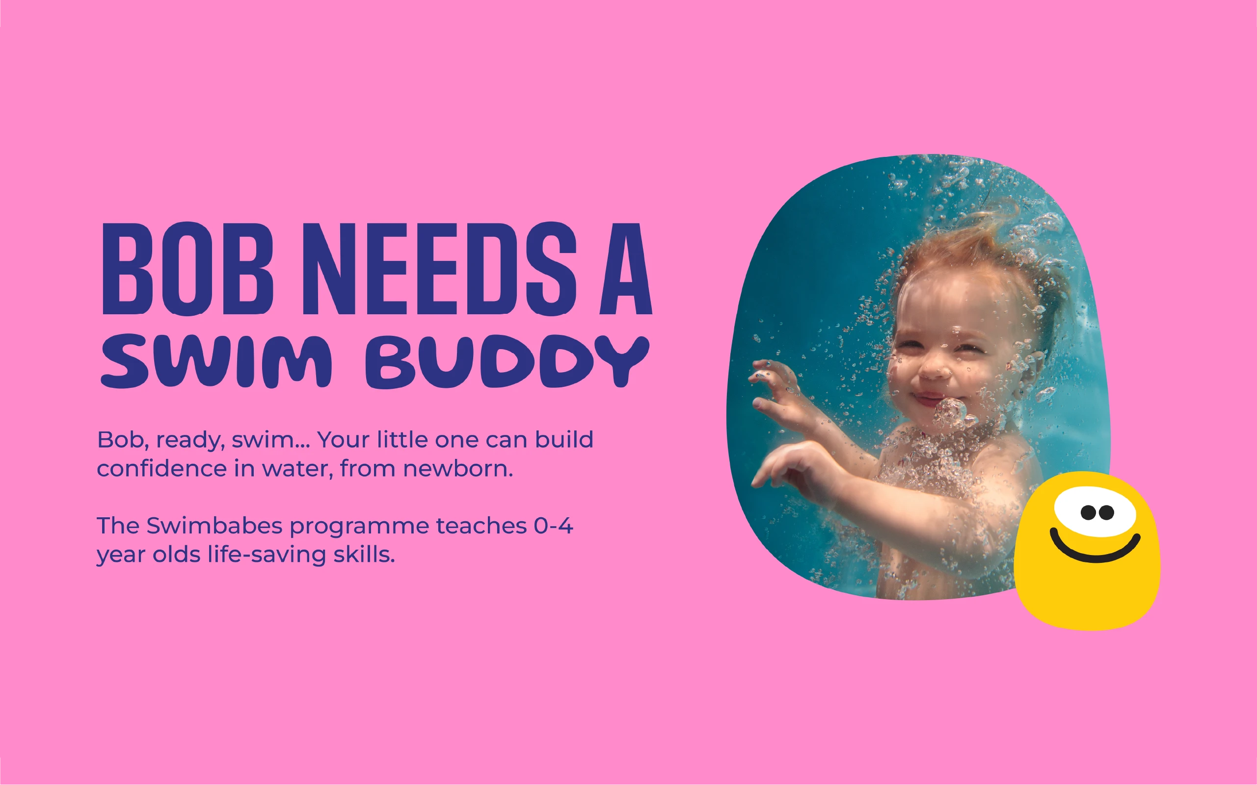
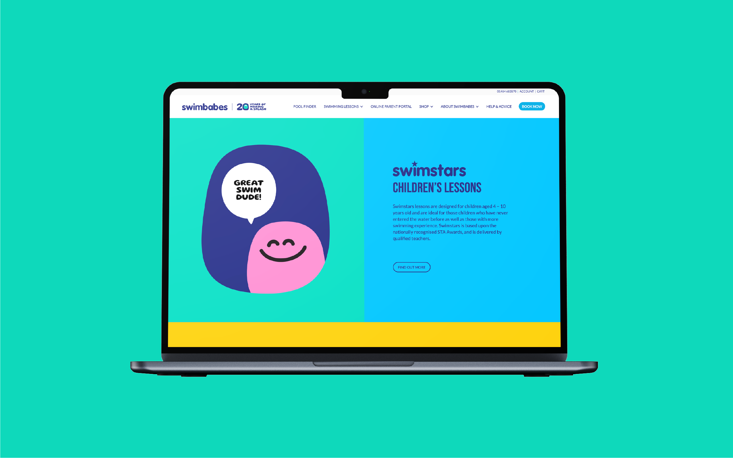
We approached the project as an evolution, not a reinvention – keeping the charm people already loved while giving every element a modern lift. Starting with the logo, we refined and simplified the design to improve legibility and scalability across digital and physical environments. The typography was then modernised to feel more contemporary and accessible, striking a balance between playfulness and professionalism. Meanwhile, a brighter colour palette reinforced Swimbabes’ joyful personality while improving contrast and digital visibility.
Much-loved mascot Bob was also reimagined – redrawn with cleaner lines and a livelier expression, and brought to life through charming new animations. To build a richer, more flexible visual language, we introduced three new character friends too, creating opportunities for storytelling, variety, and emotional connection across different campaigns and touchpoints.
But we didn’t stop there. Alongside the creative work, we put solid strategic foundations in place to help Swimbabes manage its refreshed brand with confidence. We introduced tracking methods to give the team better visibility of what’s working across channels, supported by clear brand guidelines and ready-to-use social media templates to keep communications consistent. A light-touch social audit and strategy helped shape future content direction, while keyword research informed a quarterly content plan designed to boost visibility and engagement. We also reviewed the website, identifying opportunities to bring the new brand to life online and enhance the user experience, ensuring Swimbabes’ new identity made waves long after launch.


A right result!
What started as a gentle brand refresh has given Swimbabes a renewed sense of energy and direction. The evolved identity strengthens the trust and affection built over decades, while bringing a new confidence that helps the brand stand out and stay relevant. By protecting hard-earned brand equity and enhancing its outward presence, Swimbabes now feels both reassuringly familiar and unmistakably current. The refreshed design radiates warmth, professionalism, and care – everything parents already associate with the experience. And, with a suite of integrated tools to support consistency and creativity, the team can confidently carry the brand forward, ensuring it continues to make a splash with families for years to come.
 After
After 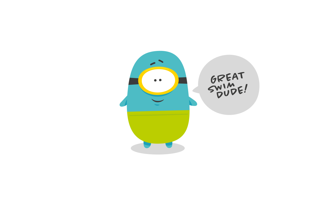 Before
Karla Robbeson,
Senior designer, The Bigger Boat
Laura Molloy,
Founder and managing director, Swimbabes