21 Degrees
After almost three decades as a trusted name in sustainable construction, 21 Degrees (formerly Green Building Store) had reached a crossroads. While its reputation for high-quality products and deep technical knowledge was unwavering, its brand still reflected its origins as a product supplier rather than the whole-house solutions provider it had evolved into. This disconnect was creating confusion, limiting perceived value and constraining growth.
The Bigger Boat was engaged to deliver a full-scale rebrand – from a new name and visual identity to a redesigned website, tone of voice, and brand applications – to reposition 21 Degrees as a cohesive, high-value business, ready for its next phase of growth and a higher exit valuation.


The challenge
The challenge wasn’t the business itself, but how it was being understood. After almost three decades of building trust in sustainable construction, the company had evolved into something far more sophisticated than its name suggested. ‘Green Building Store’ implied a physical retail outlet or a housebuilder, with sustainability as the headline, while the real value lay in delivering healthier, more comfortable, high-performing homes through a whole-house approach.
 After
After  Before
As the business expanded its consultancy, design, and renewable installation capabilities, this disconnect became more apparent. The dated identity and website failed to reflect the quality of the offer and weakened differentiation in a crowded market, making the business harder to position as a credible platform for growth. From a buy-and-build perspective, this fragmentation ultimately obscured the underlying strength of the model, increasing perceived risk for investors assessing scalability and integration potential.
To support the next phase of growth, the business needed a brand that honoured its heritage to retain hard-earned trust while presenting a coherent proposition primed for the future.


Our solution
We began by stepping back from the brand itself and focusing on the role it needed to play in the next phase of the business. Through our collaborative GrowHow workshop with the leadership team, we explored how the company had evolved, what made it valuable, and how it needed to be understood by customers, talent, and future investors. This work revealed a clear shift from selling products to delivering healthier, more comfortable, high-performing homes through an integrated, whole-house approach.
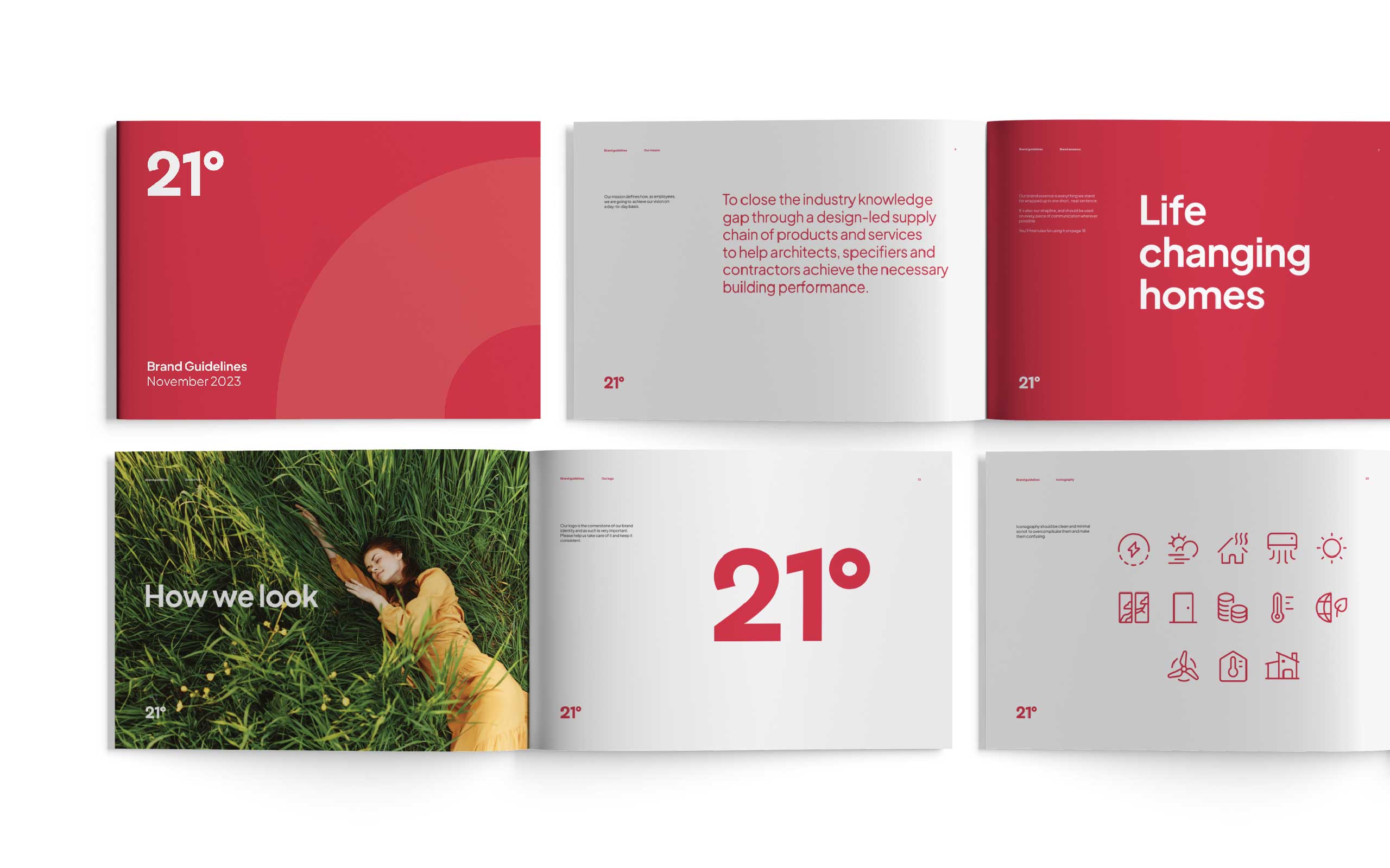
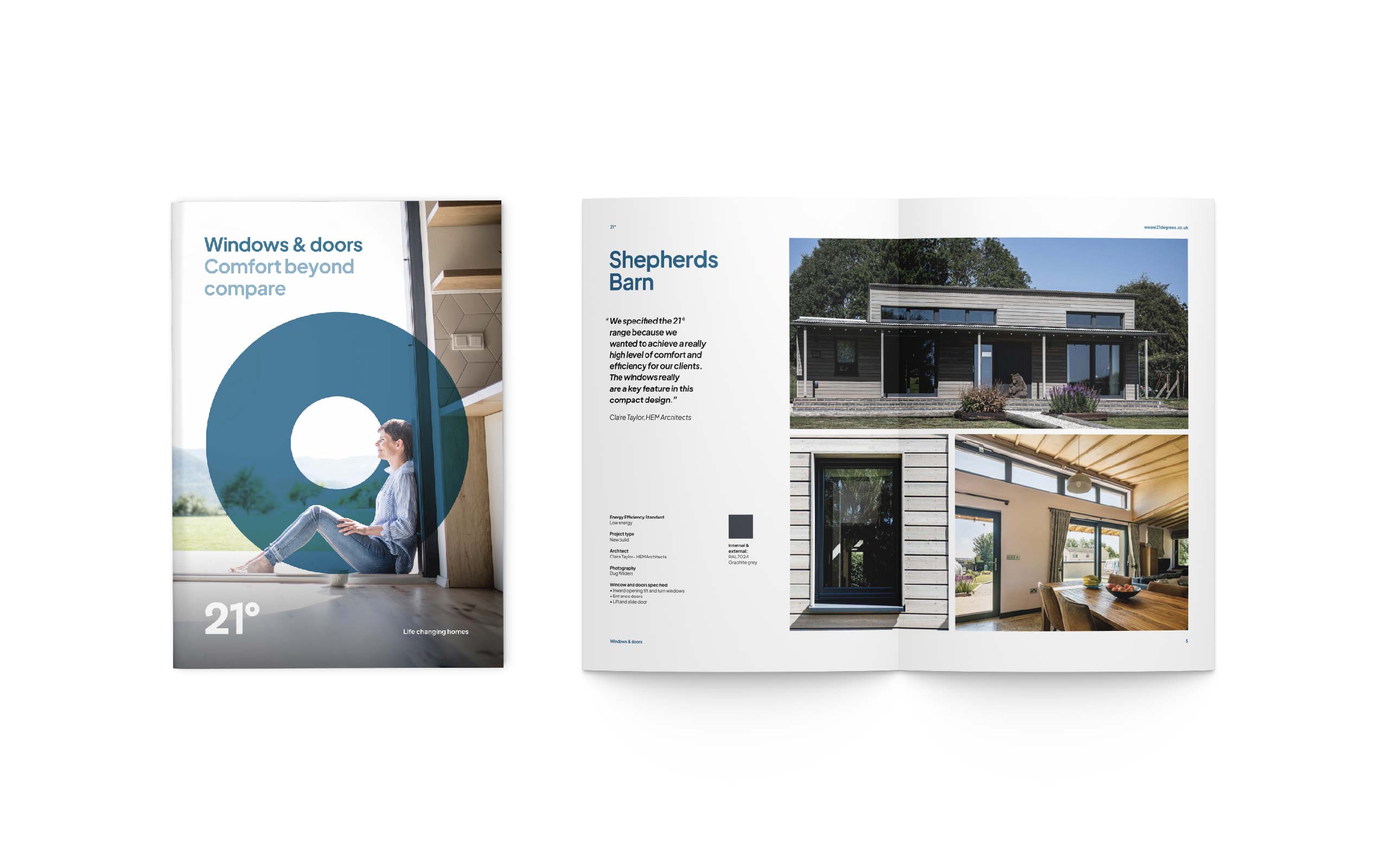
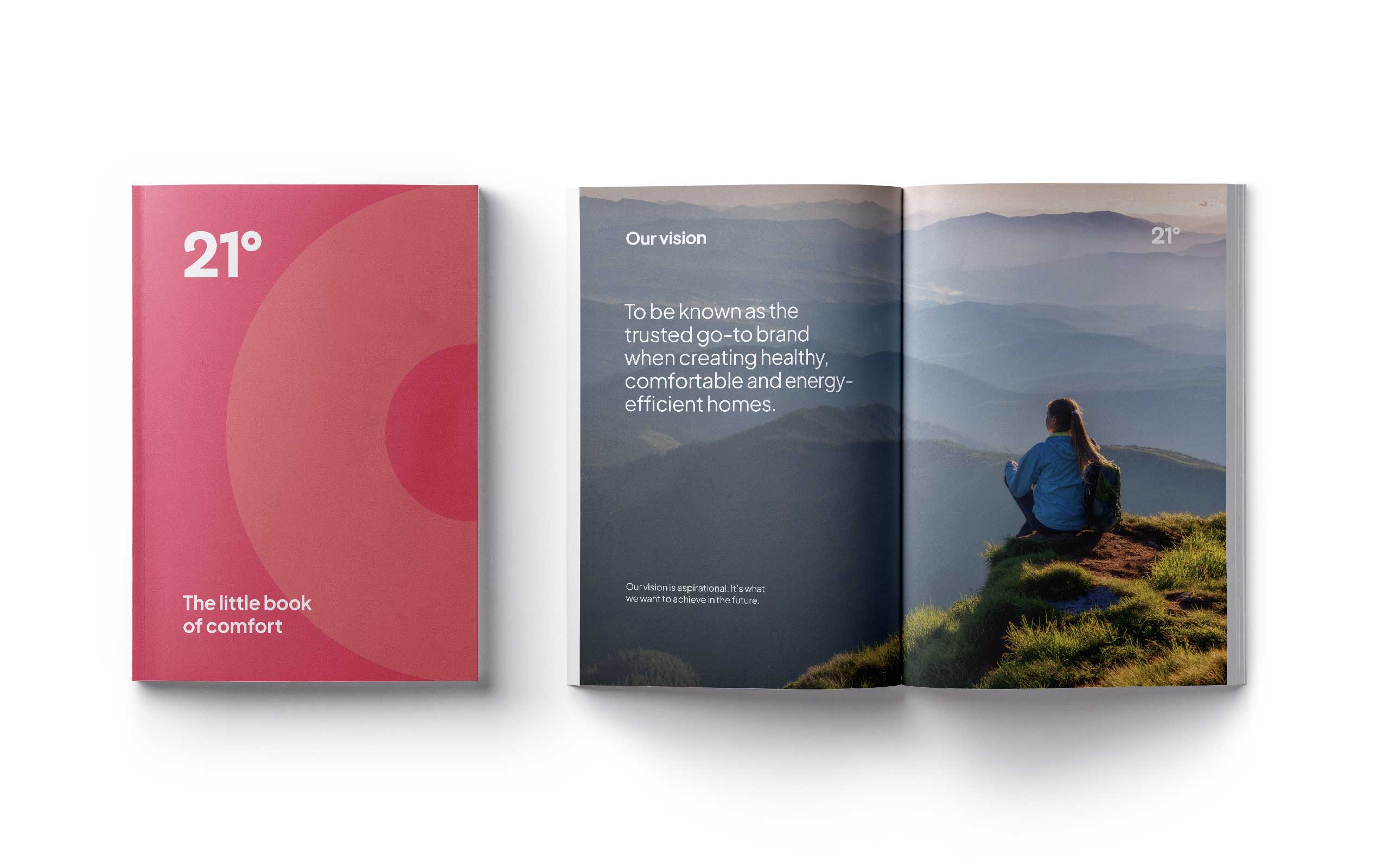
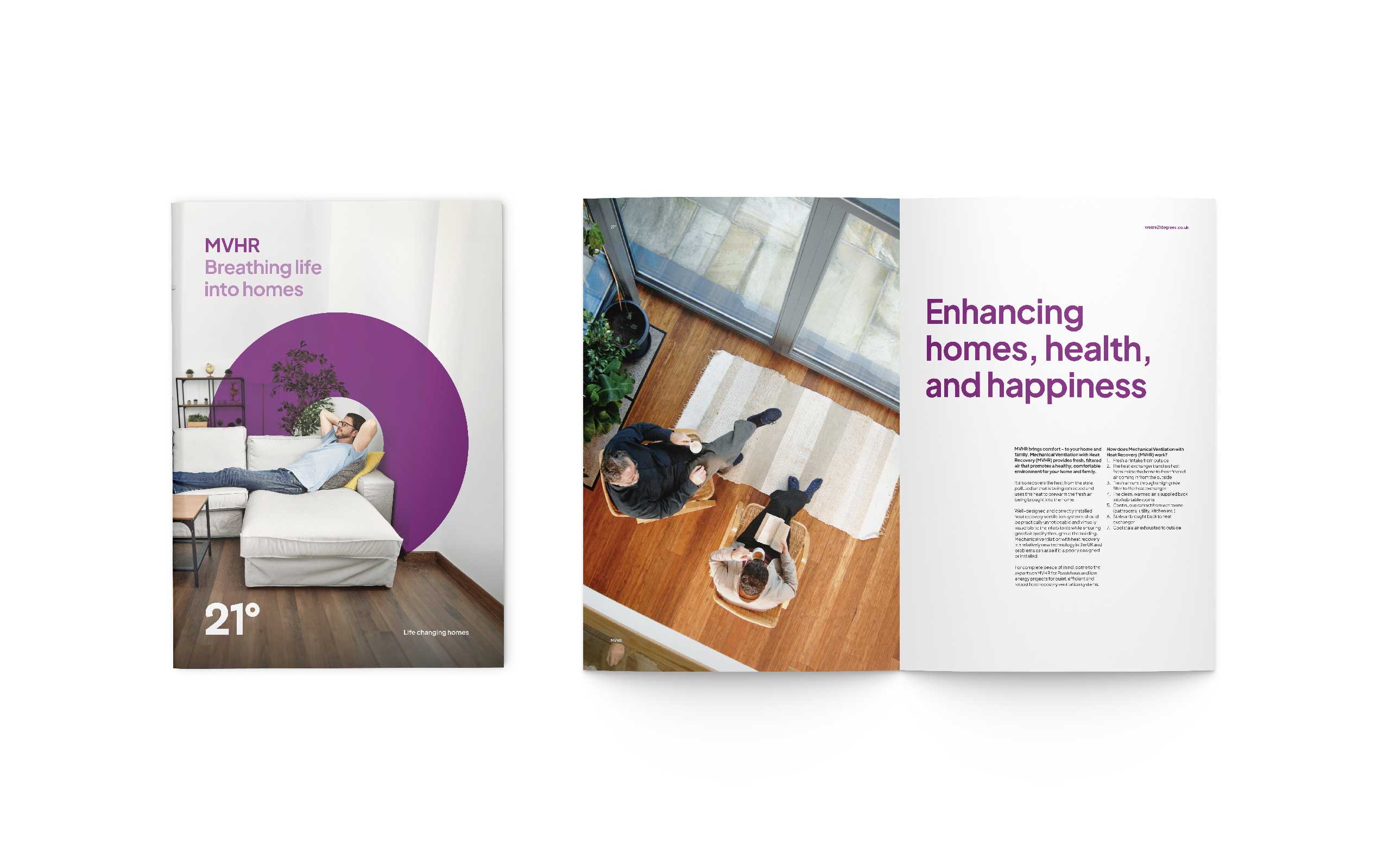
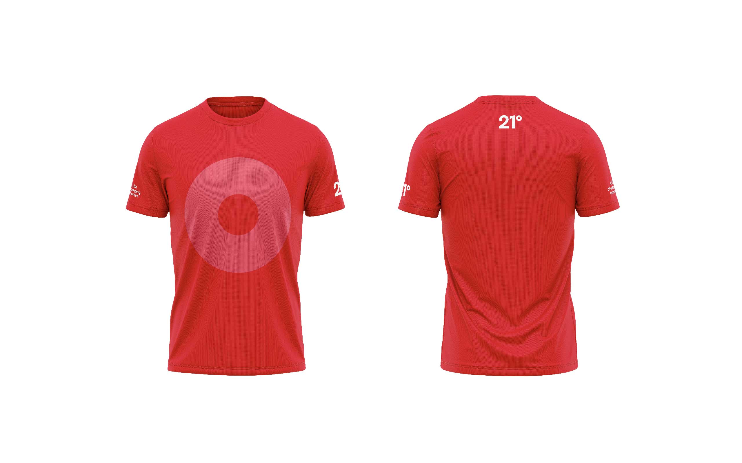
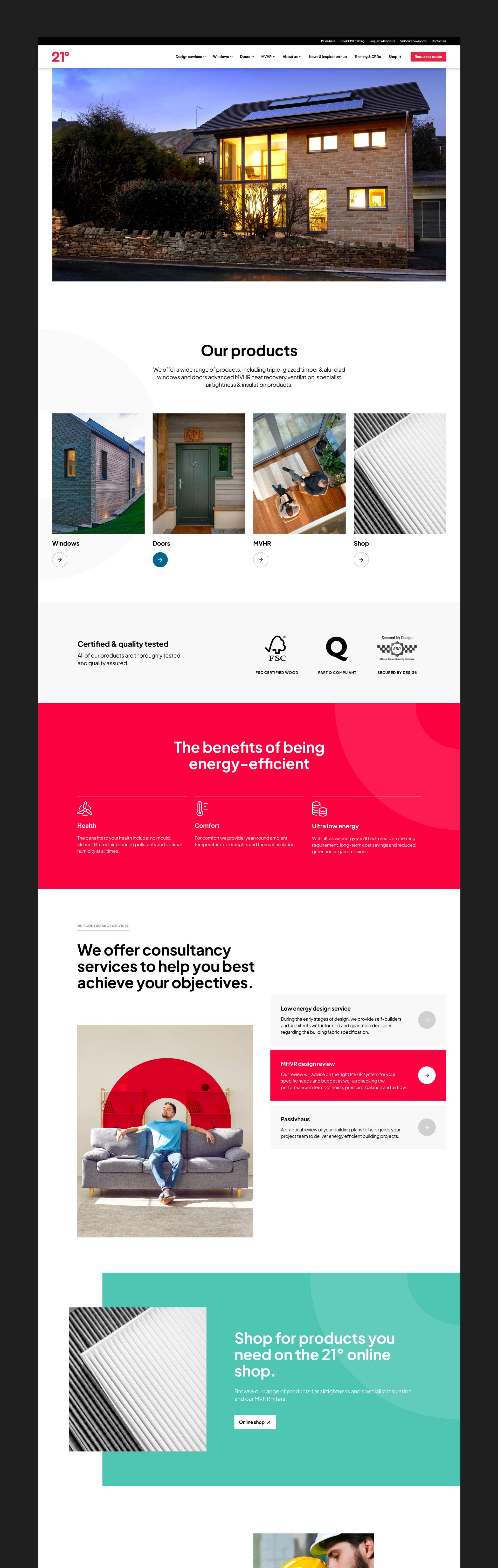
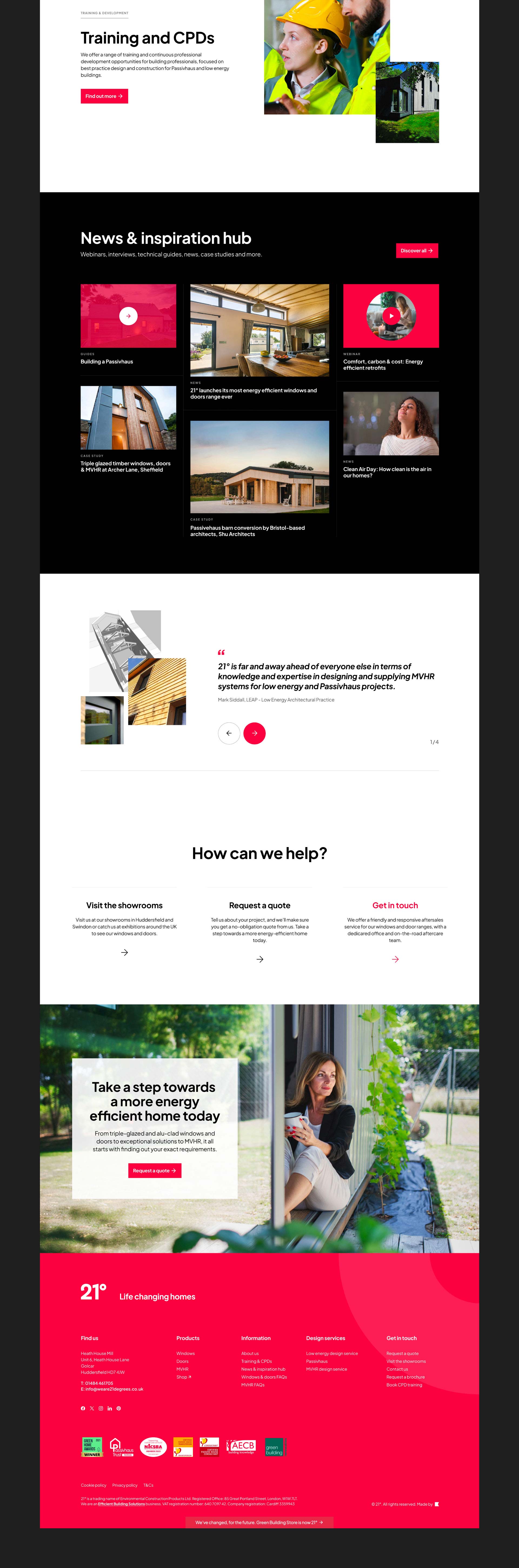
The decision to rename the business 21 Degrees was a pivotal moment in the process. Often cited as the ideal indoor temperature for health and comfort, the name captured the essence of the offer in a simple yet human way, while marking a confident step beyond the company’s static retail origins. A new visual identity and brand architecture followed, designed to bring consultancy, design, supply, and installation together under one clear and coherent proposition.


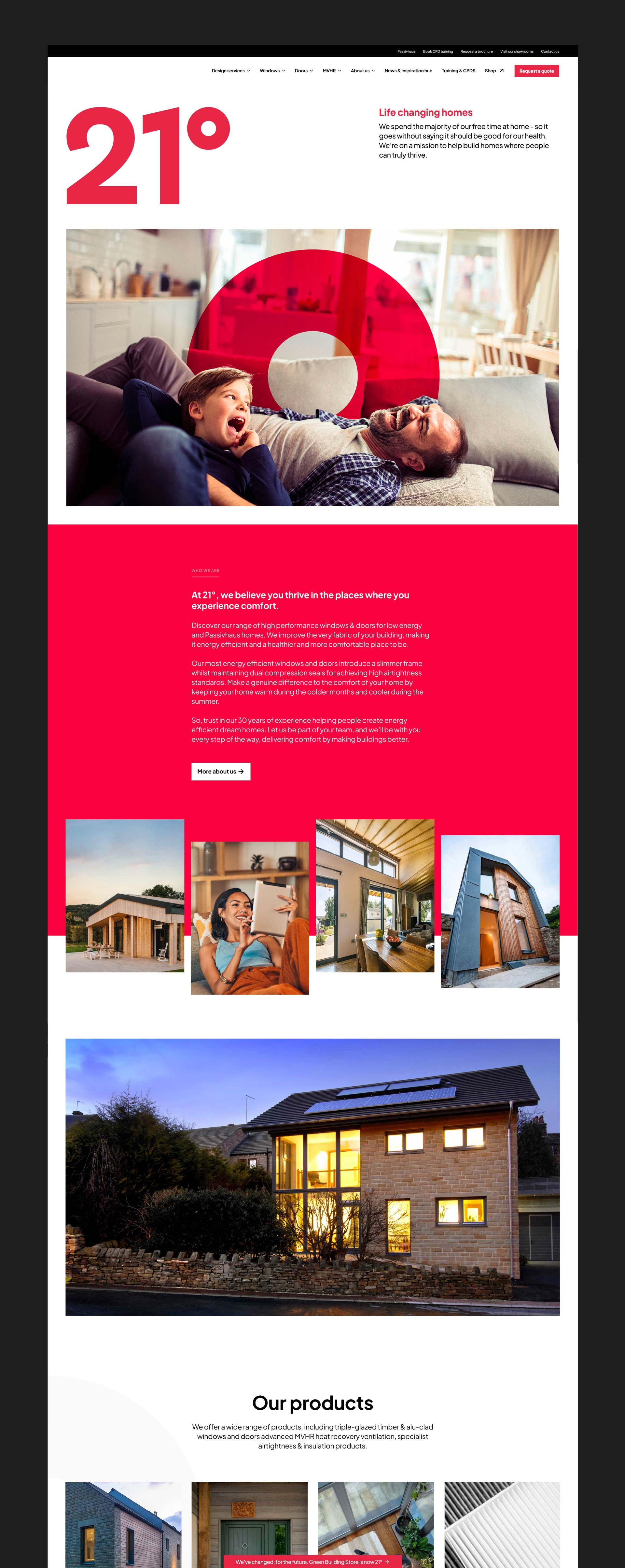
We then rebuilt the website with navigation, performance, and SEO front of mind, improving the user experience while strengthening visibility for high-value search terms. The result was an award-winning digital platform, recognised by CSS Design Awards for Best UI, UX, and Innovation. Supported by a phased rollout and internal engagement strategy for a truly seamless transition, the rebrand retained decades of hard-earned trust while repositioning the business as a highly credible platform with a risk-free business model that could scale with ease.


Doug Main
Creative director, The Bigger Boat


Andy Mitchell
Managing director at 21 Degrees